Red Rising: Graphic World-Building
Red Rising: Graphic World-Building explores the visual identity of a hypothetical film adaptation of Pierce Brown’s science-fiction novel. Through a collection of fictional posters, cards and invitations, I developed two contrasting design systems for the Reds and Golds, reflecting their vastly different lifestyles and positions within society.
Drawing inspiration from retro-industrial graphics and futuristic Roman aesthetics, this project explores how graphic design can bring fictional worlds to life, communicate social hierarchies and tell stories through everyday objects.

Red Society Graphic Mockups
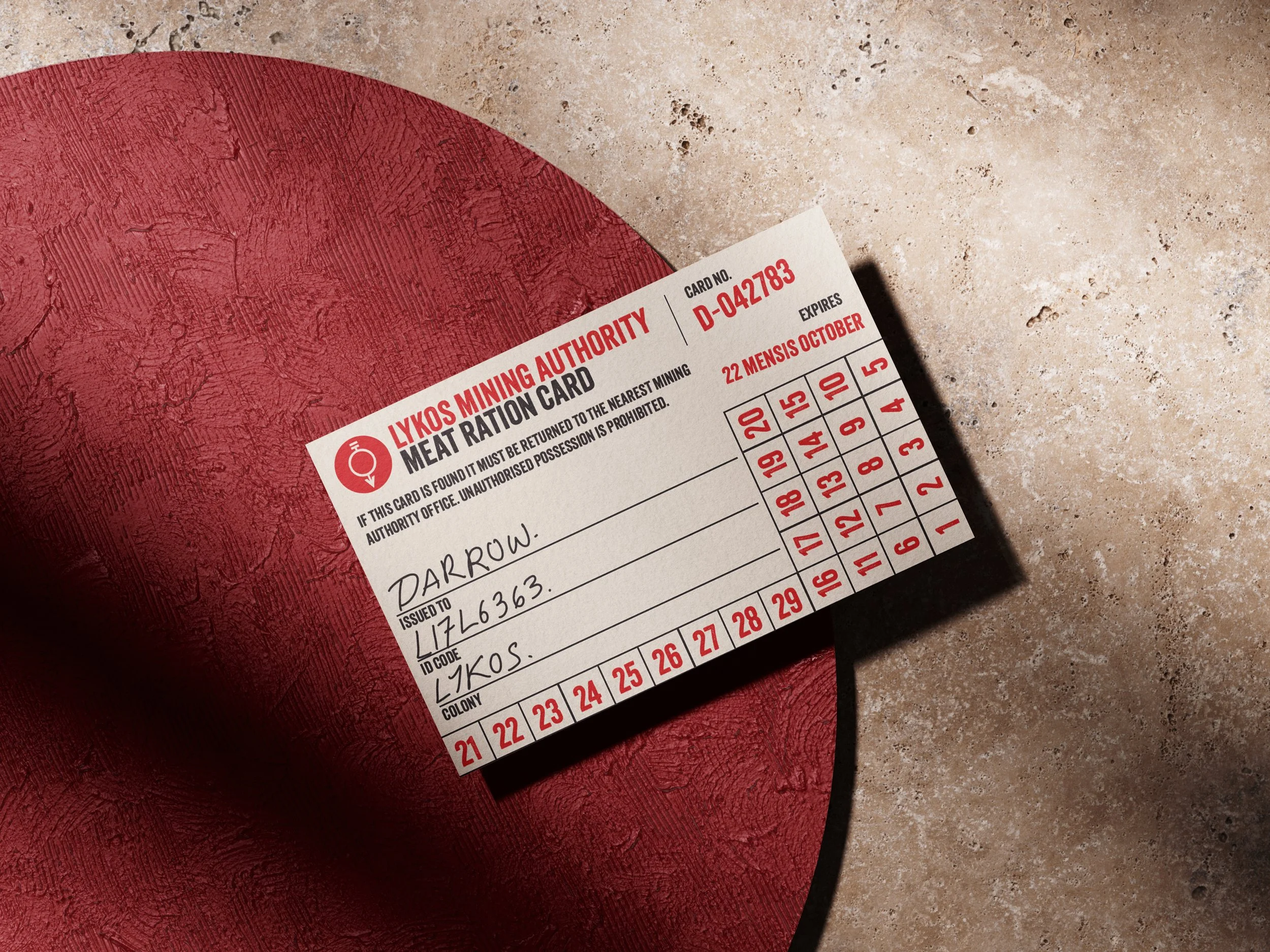
The Red Society draws inspiration from retro-industrial design, using worn textures, bold typography and practical materials to reflect a working-class community shaped by labour, survival and solidarity. These designs focus on everyday necessities and the importance of community within the mines.
“The ration card and safety poster work really well together! They feel like they belong in the same environment, and I like how the designs show what everyday life might be
like for the miners.“ - Anonymous Vis Com User
Gold Society Graphic Mockups
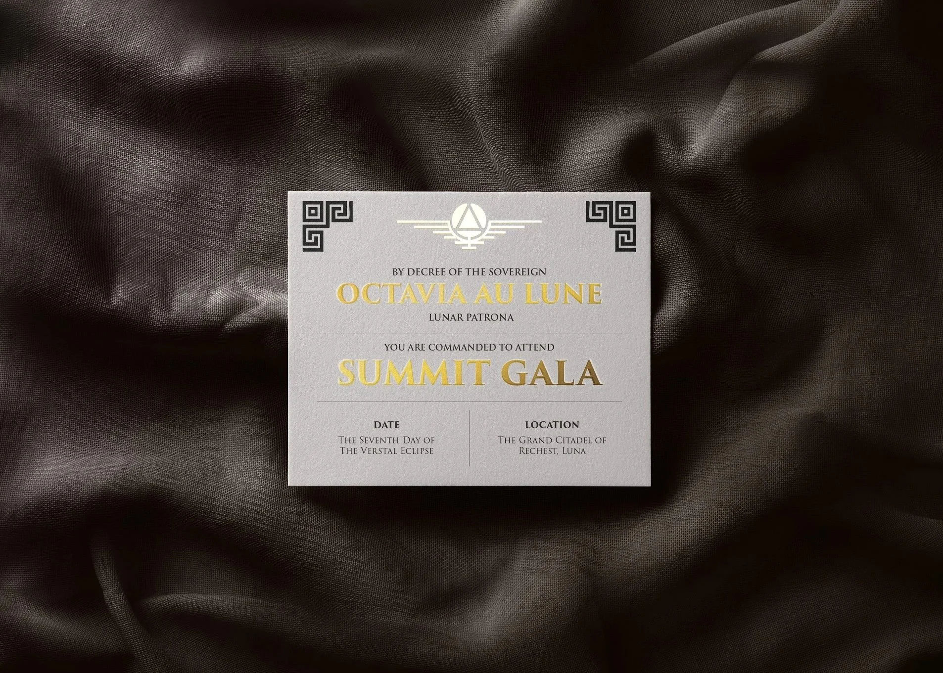
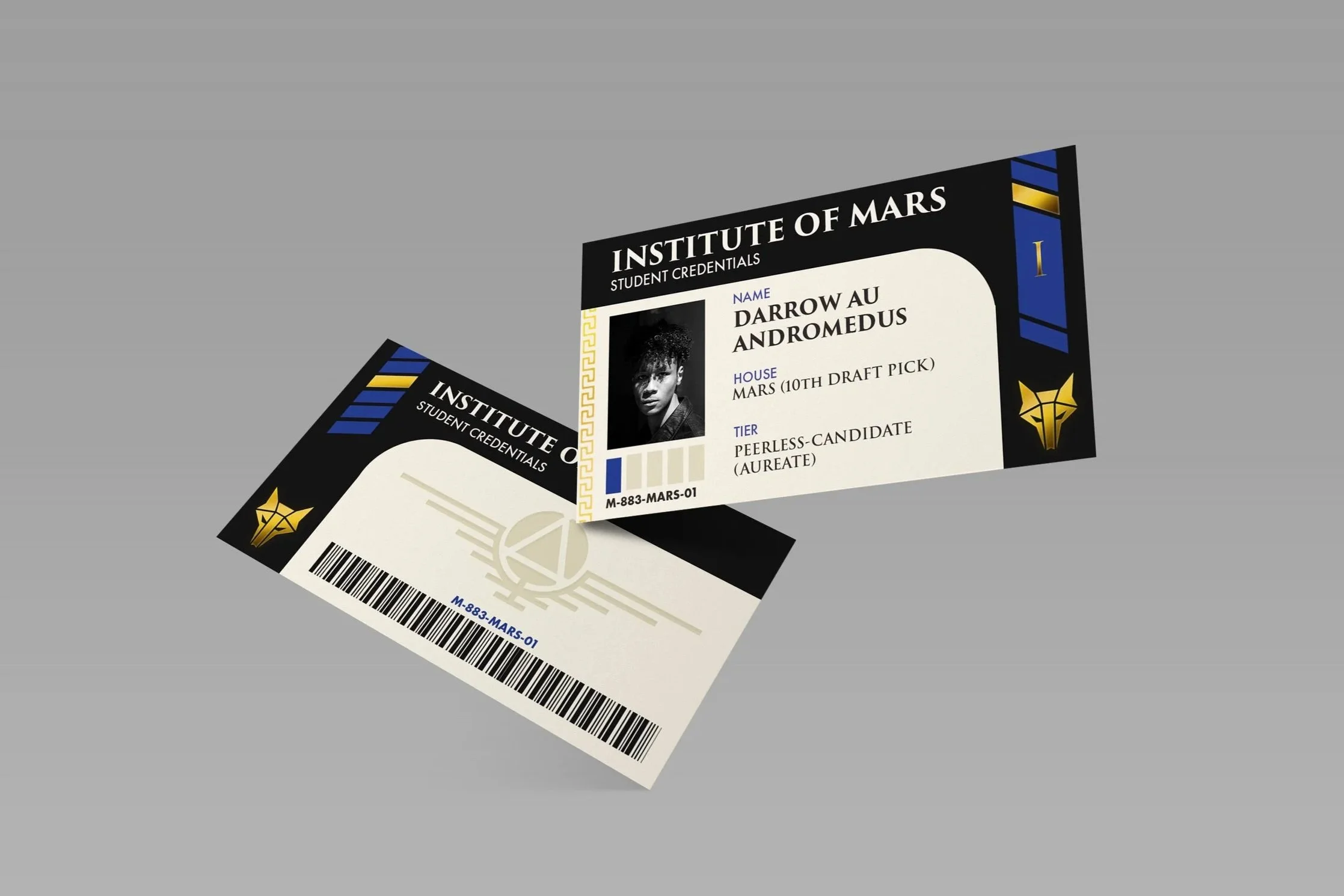
The Gold Society, in contrast, combines sleek, futuristic aesthetics with classical Roman influences, refined typography and elegant materials to communicate luxury, authority and exclusivity. These designs reflect a world where status and power are embedded into everyday life.
“The Gold designs feel so different from the Reds!
Everything looks much cleaner and more luxurious, which really helps communicate the difference in wealth and status between the two groups.” - Anonymous Vis Com User
Red Society Style Guide
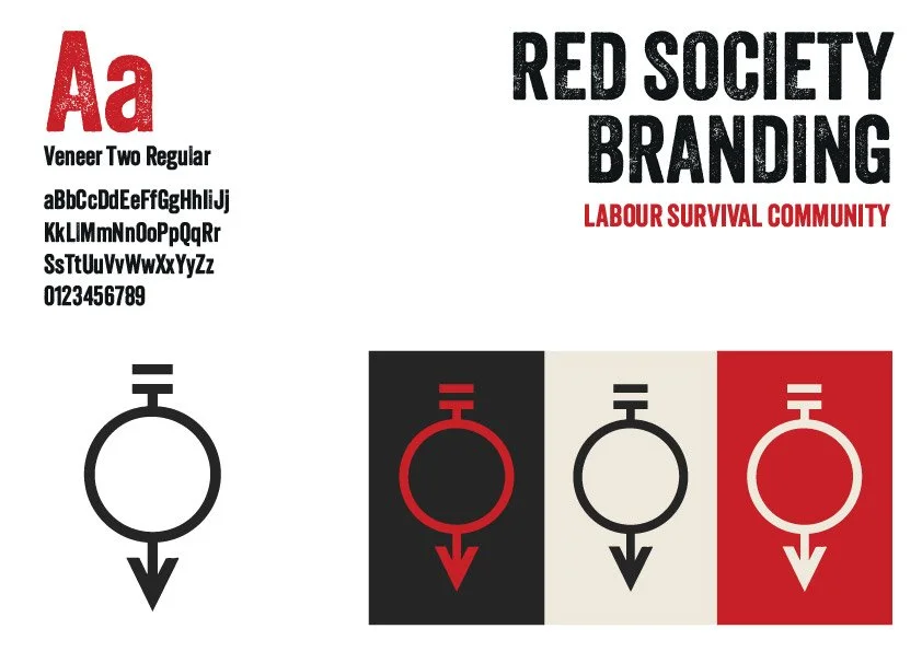
The Red Society's visual identity draws inspiration from retro-industrial design, reflecting the harsh working conditions and community-focused lives of the miners. A bold red, black and cream colour palette, combined with distressed Veneer Two typography and a simplified Red insignia, creates a practical, worn and utilitarian aesthetic.
Gold Society Style Guide
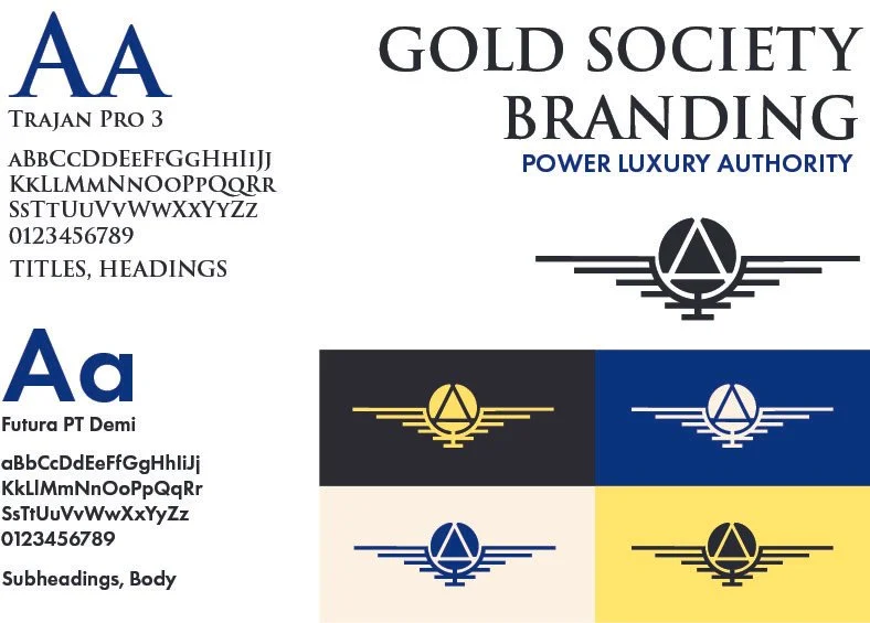
The Gold Society's visual identity combines futuristic minimalism with classical Roman influences to communicate power, luxury and authority. Trajan Pro 3 introduces a sense of tradition and prestige, while Futura PT Demi provides a clean, modern contrast. The striking blue, gold, black and cream palette, alongside a geometric imperial insignia, reinforces the Society's wealth and exclusivity.